Increator Company
Light Room
Increator Company
Editorial, warm, restrained. Think a premium print magazine: generous whitespace, serif display in italic, the palette pulled back to let the content breathe.
01 — Identity
ICC and Mike & Matty share one visual language. The only thing that flips is the mode — ICC reads clean and editorial on cream, Mike & Matty reads cinematic and moody on near-black.
Light Room
Editorial, warm, restrained. Think a premium print magazine: generous whitespace, serif display in italic, the palette pulled back to let the content breathe.
Dark Room
Cinematic, moody, contemplative. Think a documentary opener: deep charcoal field, a single source of light, hand-drawn textures glowing through pencil shade.
We explain the why behind the work — clear, considered, a little contrarian.
Never hype. Never clickbait. Never a 10-word sentence when 6 will do.
02 — Color
Every swatch is a one-click copy. Tier 1 is the foundation — almost every surface lives here. Tier 2 is the warm-earthy supporting cast. Tier 3 is for accents, highlights, and data visualization.
Use these for 90% of surfaces. Buttermilk is the ICC canvas. Pepper is the M&M canvas. Emerald is our brand accent (the glow color).
Warm, earthy, editorial. For section accents, print applications, and richer compositions. Never use more than two at once.
Bright, saturated, friendly. Use for data viz, highlights, badges, and motion-graphic flourishes. Honey is the go-to emphasis color in Mike & Matty lower-thirds.
03 — Typography
Lausanne carries structure, weight, and clarity. Larken adds emphasis and emotion. Every headline pairs the two — a structural phrase interrupted by a single expressive word in Larken italic.
Display · Emphasis
The system for thinking.
Italic for one word of emphasis.
Weights used: Regular 400, Medium 500, Italic.
Body · UI · Structure
Structure is a form of care.
Weights: 300 / 400 / 500 / 700.
Body copy, captions, lower-third descriptors, UI chrome, data viz labels.
Signature pairing
but what most people think is learning
Lausanne Medium carries the line; the emphasis word is Larken italic in the emphasis color. The single-word emphasis is the hook — never emphasize more than one word per line.
04 — Canvases
Beyond Buttermilk and Pepper, we have signature gradient canvases — each a deep saturated color washing into cream paper, with visible film grain. They're the bedrock for editorial covers, video thumbnails, deck title slides, and motion-graphic backgrounds.
Emerald
Our default canvas. The brand-emerald wash. Use for ICC editorial, strategy decks, motion-graphic halos, and the M&M hero frame.
Navy
For long-form research, technical breakdowns, and any content that should signal “studious, considered, after-hours.” Pairs well with white type.
Maroon
Wine-purple wash for narrative-led pieces, founder stories, longform editorial, and year-end retrospectives. The most “magazine” of the set.
Orange
Carnelian-burnt-sienna wash for personal pieces, behind-the-scenes, lifestyle and travel. The most approachable canvas.
Emerald canvas · grid
The branded backdrop behind on-screen stats, chapter titles, and Frame Studies — emerald vignette with a hairline grid. 3840×2160.
Keep the paper grain visible. The canvas is paper, not flat color.
Place type in the cream side of the wash where contrast is highest.
Mix two canvases in the same piece. Pick one and commit.
Recreate the gradient from scratch in CSS. Always use the source file.
For Style A storyboards and hero illustrations, default to Emerald vignette. It ties Style A to Style B visually so cuts feel cohesive.
Pepper
#211F20 — classic M&M canvas. Use when you want the figure isolated against pure dark.
Emerald vignette · M&M default
#1C2F2C → #0B0D0D radial. Default for storyboards. Gives depth and ties to Style B.
Buttermilk
#FAFAF3 — ICC default and occasional Instagram editorial moments.
05 — Logos
One brand, three logo systems. The wordmark is the universal identity — used everywhere except YouTube. The illustrated sticker mark is the YouTube channel avatar. The plain Lausanne text is the minimal fallback for footers and captions.
For ICC, decks, PDFs, web, print, and any context where the brand needs to read clean and editorial. Available horizontal and stacked, in four colorways.
Horizontal
 Pepper on Buttermilk
  Buttermilk on Pepper Buttermilk on Emerald
  White on photo
 Stacked
 Pepper on Buttermilk
  Buttermilk on Pepper Buttermilk on Emerald
  White on photo
 The illustrated hand-lettered mark with the green wave. Used as the YouTube channel avatar and inside channel-card pills only. Never use elsewhere — it's a sub-brand voice, not the universal identity.
 YouTube avatar context
 Mike & Matty
@mikeandmatty · 247K
Just "Mike & Matty" set in Lausanne — the quietest version of the brand. For email signatures, footers, captions, and lower-thirds where even the wordmark would be too loud.
Mike & Matty
Lausanne 550 · light on darkMike & Matty
Lausanne 550 · dark on lightDo Maintain clearspace equal to the cap-height of the “M”.
MIKE & MATTY
Don't Distort, skew, recolor off-brand, or add effects.
Do On busy photography, use the white wordmark with a subtle drop shadow.
MIKE & MATTY
Don't Use the sticker mark anywhere except the YouTube channel.
06 — Motion graphics
A growing library of multi-clip motion shapes — venn, bars, line graphs, funnels, pyramids, matrices, spectrums, timelines, flywheels, plus an editor-style text layer for headline + emphasis word + caption. Each is a parameterized HTML scene that records cleanly clip-by-clip at 4K. No copy is baked into the shape primitives, so editors stay free to type-set their own in Premiere or DaVinci.
2px emerald stroke with an outer glow on dark; a clean hairline on light. One source of light per scene — let darkness (or paper) do the rest. Recorded at 4K for delivery.
2 or 3 circles, horizontal bowtie or equilateral.
3–7 bars · ascending, descending, or wave.
4–8 points · rise, fall, wave, J-curve.
3–4 stages · closed stack or open V.
3–4 tiers · base up or top down.
Axes + boxes, or axes-only mode. Quadrants ignite in order.
1D scale · marker or range, optional end poles.
3–6 phases · dot + line builds dot-by-dot, optional current-state ring.
3–6 nodes · each clip reveals a node + its outgoing arc.
Lausanne headline + Larken italic emphasis word + uppercase caption. The only primitive with copy.
Template builder
Pick a shape, set the parameters, then play it through or record it clip-by-clip. Every primitive supports dark M&M and light ICC canvases plus auto / emerald / honey / carnelian stroke recipes, adjustable speed and easing.
07 — Thumbnails
Thumbnails are where editors most often go off-brand. The rules are simple: one subject, one emphasis word, one source of light. Never more.
Cinematic library photo, 3–4 word headline in Lausanne 550 white with one Larken Italic emphasis word in Honey. Headline on top-third or bottom-third over the body — never on the face. Optional channel-card pill with the sticker mark. When the photo carries the whole idea — a strong expression, a charged moment, an unusual composition — drop the overlay and let the image do the work (use sparingly, ~1 in 5). Drag any slider to see the before / after grade.
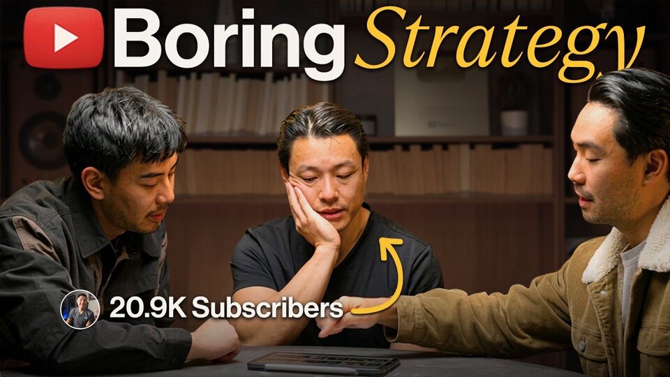
Text grid: 3–4 words max. Place on top-third or bottom-third, never on the face. Emphasis word in Larken Italic, Honey #FAC53A. Rest in Lausanne 550, Buttermilk. Never all-caps. Never stroke outlines. Never full sentences.
YOU WON'T BELIEVE THIS!!!
How to think better about many things at once
watch this NOW
Mind Blown Truth
08 — Photography
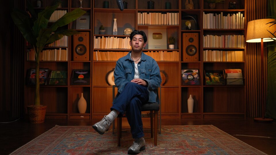
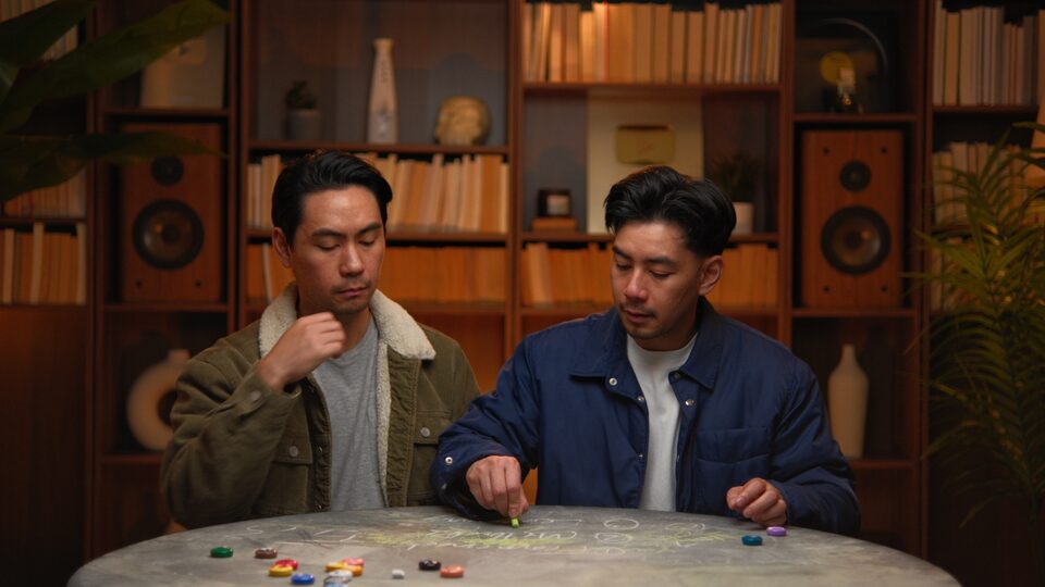
Our visual identity isn't only logos and type — it's a specific room, a specific wardrobe, a specific lighting recipe. Library shelves, vintage hi-fi, plants, denim, tungsten warmth, teal-black shadow. The set is itself a brand asset.
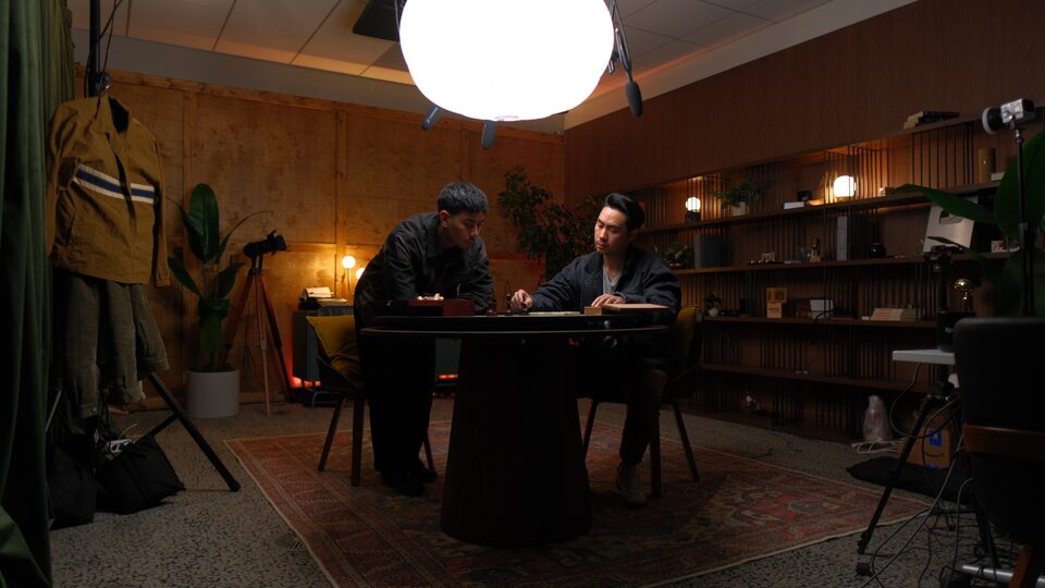
The studio
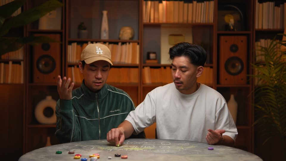
Plywood walls, Persian rug, slatted shelving, big diffuser globe, hanging vintage workwear, vintage tripod with film camera. Two configurations: the close-up library set, and this wider studio frame.
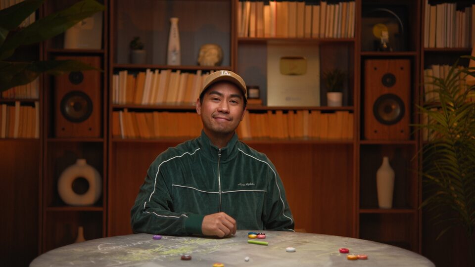
Set
Library room. Warm-wood floor-to-ceiling shelves, paperbacks shot edge-on, vintage hi-fi speakers as symmetry anchors, vinyl, plants, ceramic vases, the silver YouTube plaque.
Lighting
Single warm key from camera-right at ~30°. Tungsten highlights, teal-black shadows. Practical lamps as ambient fill. Subtle film grain in shadows.
Wardrobe
Earthy workwear. Denim chore jackets, olive sherpa, emerald velour track jacket, charcoal canvas, grey crewnecks. No brights. No logos beyond their own pieces.
Camera
Eye-level, ~50mm feel. Medium-shallow depth of field. Subject sharp, room readable but soft. 16:9. Direct-to-camera or angled at the chalk-table.
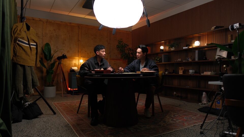
Use the wide-vibe shots as hero images on websites and decks. The room sells the brand.
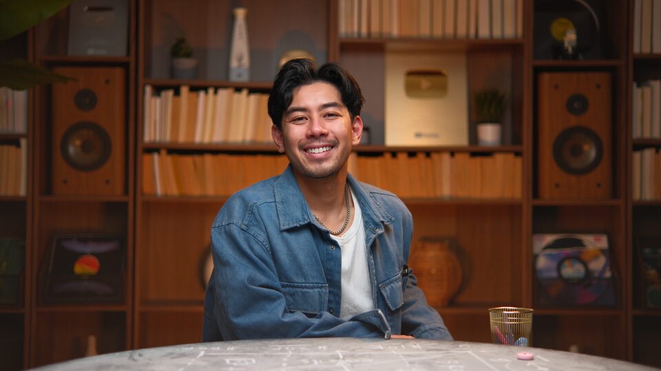
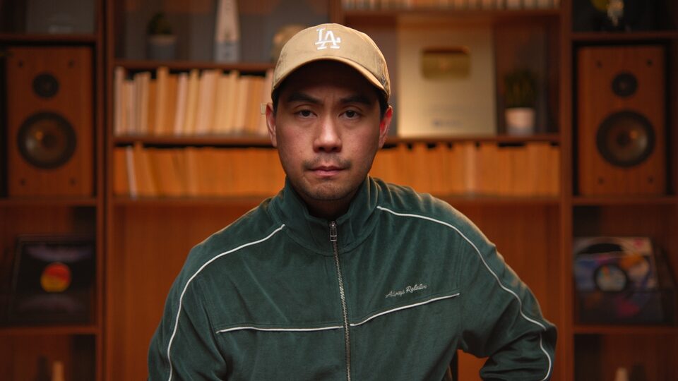
Use library close-ups for thumbnails. Tight crop, neutral expression, direct-to-camera.
Use the chalk-table duo shot for About pages, bios, and partnership decks.
Crop the photos to remove the room. The room is the brand.
Apply heavy filters, B&W, or duotone. The existing color grade IS the look.
Add stock textures or graphic overlays on the photos. The photo is the design.
09 — Applications
The system scales from a 16:9 slide to a vertical carousel. Here are the patterns — every one built from the same tokens.
01 / 12
Creator decisions, explained.
Mike & Matty · 2026Stop posting.
Start thinking.
Swipe →Output vs input
Jesse Increator
FOUNDER · MIKE & MATTY
10 — Downloads
Logos in four colorways, the headshot library in Canva, the canvas gradients, the color palette in Adobe Swatch format, and the approved thumbnail reference set — everything you need to ship work that's on-brand.
Adobe Swatch Exchange (.ase) + JSON + CSS variables
Download →Wordmark SVGs (4 colors, horizontal + stacked) + sticker mark
Download →Mike & Matty headshots in Canva · always-current set
Open in Canva ↗Reference set of approved Mike & Matty thumbnails
Download →Emerald, Navy, Maroon, Orange paper-gradient JPGs
Download →The brand background — 3840×2160 PNG. Behind full-screen titles & stats. SVG source in the repo.
Download →Same canvas with a slow drift. Open full-screen, press R, screen-record at 4K.
Open ↗Editors always get these wrong. One tap = copied to clipboard.